Package for SXA Responsive Image and further steps
This blog post is based on the wonderful blogpost by Sebastian Winter that details how to create a SXA responsive image component. Since it has many steps, I have created a package for the general steps and then highlighted what else is needed to integrate it into your site.
Also, are you wondering why the name given for your Available Rendering is not displayed in the SXA toolbox and instead the rendering folder name is displayed then, read-on.
1. Install the Responsive Image package.
2. Once this package is installed, you must be able to see the following entries in Master DB:

3. These entries will be present in Core DB:

4. If needed, use the RenameItem PowerShell ISE script to rename the folder structure in master db as per your need
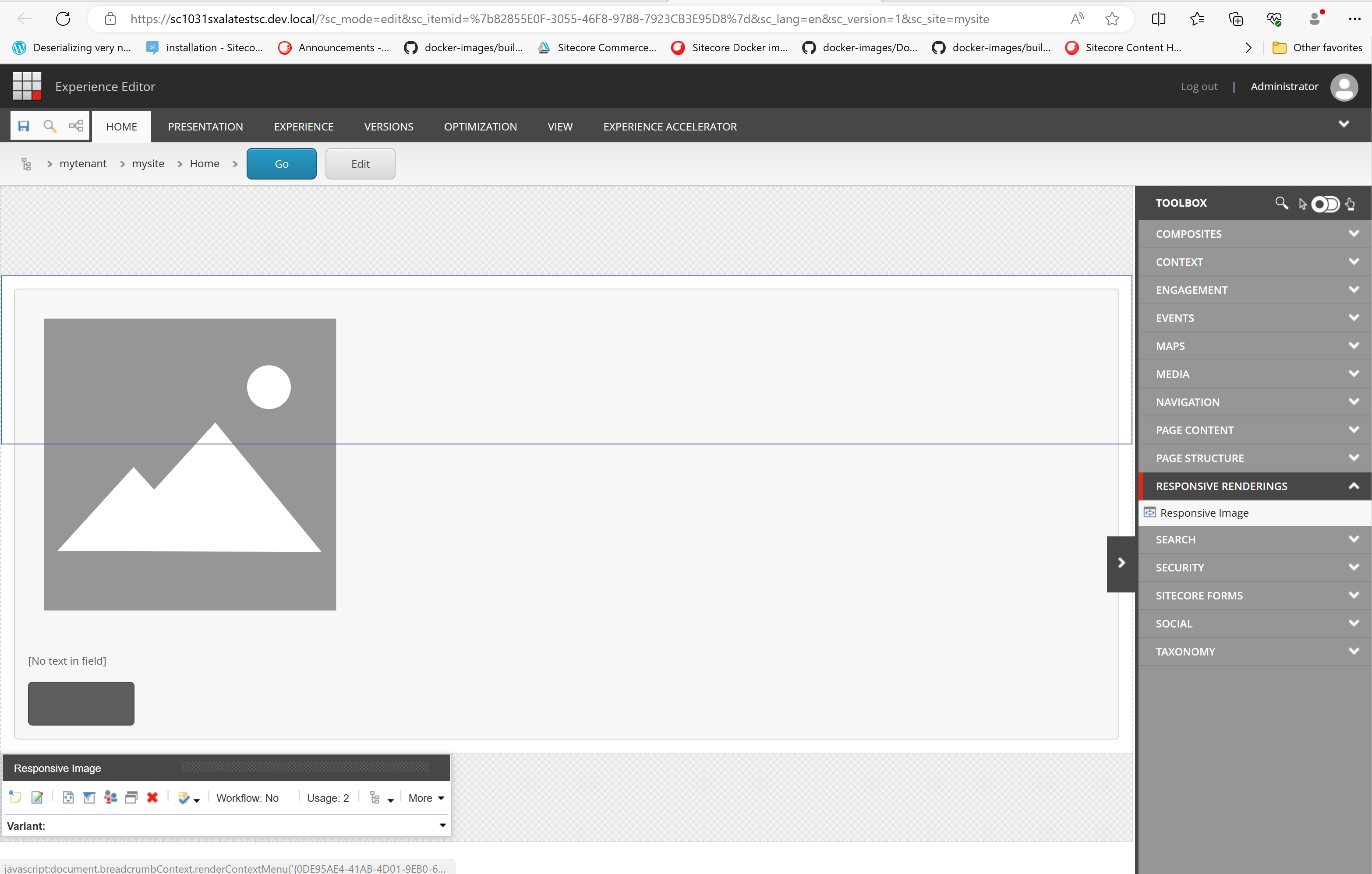
5. Within the SXA site, create a responsive image variant using the branch template,
/sitecore/templates/Branches/Feature/Responsive Renderings/Default Responsive Image Variant
Name the item as Responsive Image:

6. Next, add Available Renderings and name it as how you wish to see it in SXA toolbox, I named it Responsive Renderings:
Note that if you want to see the Available Renderings name as section name in toolbox, you must check this option in Available Renderings:

If the above checkbox is not selected, SXA toolbox sections will display the rendering folder name:

7. Ensure Responsive Image is added to rendering list in the new Available Rendering:


Comments
Post a Comment